
Wall paint colors can shift dramatically once they leave a sample card and cover a full wall in a Kirkland home. Diffuse daylight, trim color, flooring, cabinets, furnishings, and artificial lighting all influence how light, muted, or deep a shade feels.
Instead of starting with a list of popular colors, start with the amount of contrast you want in the room. Then narrow the undertone, depth, and sheen until the wall color works with the surfaces that are staying.
Start With Contrast Before You Start With Color
A room can feel calm, layered, bold, or dramatic before you ever decide between beige, green, blue, or brown. The difference often comes from how much contrast exists between the walls, trim, flooring, cabinets, and furniture.
If you want a quieter room, keep the wall and trim values closer together. If you want the architecture to stand out, create more contrast between the wall color and the trim, doors, or built-ins.
Starting with contrast gives you a design direction before hundreds of individual paint chips enter the decision.
Use the Trim Color as a Reference Point
White trim is not one universal color. Some whites lean warm, some lean cool, and some carry gray, yellow, or cream undertones that become more obvious beside a new wall color.
Compare your wall finalists directly beside the existing trim and doors. A muted green may look balanced beside a warm white but sharper beside a cooler white, while a khaki or tan can shift in the opposite direction.
If the trim is also being repainted, choose the wall and trim colors together so the contrast feels intentional rather than accidental.
Read Undertones Under Kirkland’s Actual Light
Room orientation changes how undertones show up during the day. North-facing rooms often receive cooler indirect light, while south-facing rooms usually receive warmer and more consistent daylight.
Artificial lighting adds another layer once the sun goes down. Warm bulbs can strengthen cream, tan, red, or yellow undertones, while cooler bulbs can make blue and gray undertones easier to notice.
Benjamin Moore’s room-direction guidance is a useful reference when you are comparing colors in spaces with cooler natural light.
Three 2026 Color Directions Worth Testing
The major paint brands chose very different colors for 2026, which is a good reminder that there is no single correct trend for every Kirkland home.
Warm neutral: Sherwin-Williams selected Universal Khaki SW 6150, a mid-tone neutral with a slight yellow undertone. It can work as a background color when the room already has natural wood, cream, tan, or other warm finishes.
Smoky green-blue: Behr selected Hidden Gem N430-6A, a smoky jade that blends blue and green. It is a useful direction for homeowners who want more color without moving into a bright or highly saturated green.
Deep espresso-charcoal: Benjamin Moore selected Silhouette AF-655, a dark blend of burnt umber and charcoal. It shows how deeper wall colors can be current without relying on black or navy.
Decide Where Deeper Color Belongs
A deeper wall color does not have to cover every wall to be useful. It can define a dining area, office, built-in wall, reading room, or another space where stronger contrast fits the way the room is used.
Before choosing a dark shade, look at the amount of artificial lighting, window placement, furniture, and trim contrast. A deep color can look intentional in one room and visually heavy in another.
Testing the color on several walls is more useful than assuming every dark room needs a light color or every bright room can handle a dark one.
Use Muted Color When You Want More Than a Neutral
Muted greens, softened blue-greens, clay tones, and dusty colors can add more personality without creating the contrast of a bright accent color.
The advantage of a muted color is that it can sit beside wood, stone, neutral upholstery, and white trim without demanding all of the attention in the room.
If your walls have visible texture, remember that color depth and sheen can both affect how strongly that texture shows. Our guide to painting textured walls covers the application side of that decision.
Choose Sheen for the Finished Surface, Not a Generic Room Rule
Sheen changes how much light reflects from the wall, so it can change the way the same color reads after application. Higher sheen can make surface variation and reflected light more noticeable.
The right finish depends on the exact paint formula, the condition of the wall, the amount of contact the room receives, and how often the surface needs cleaning.
Instead of assuming every living room needs eggshell or every kitchen needs satin, compare the sheen options available in the product you plan to use and choose based on the surface and household.
Test Colors Beside the Materials That Will Stay
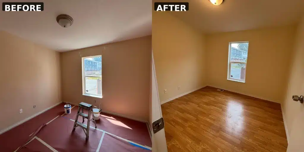
A paint sample should be judged beside the flooring, cabinets, counters, tile, furniture, and trim that will remain after the project. Those surfaces can make an undertone look stronger or weaker than it did in isolation.
Place finalists on more than one wall or use movable sample sheets. Check them in the morning, later in the day, and under your normal evening lights.
The goal is not to find a color that looks identical in every condition. It is to choose one whose changes still work with the room.
How Interland Painting Helps Kirkland Homeowners Choose
Interland Painting serves Kirkland and other Western Washington communities with interior painting for walls, ceilings, trim, doors, cabinets, drywall repair, and related preparation.
Current company information confirms more than 1,000 satisfied customers, more than 100 years of combined team experience, licensed and insured service, screened professionals, floor and furniture protection, complete cleanup, supervised quality, and clear office communication throughout the project.
Every interior project is backed by a written 1-year workmanship warranty and 5-year product warranty. For the full service, see our interior house painting services.
Frequently Asked Questions
What wall paint colors work well in a north-facing Kirkland room?
North-facing rooms often read cooler, so warmer neutrals or muted colors are worth testing. The final choice should still be compared with the trim, flooring, furniture, and artificial lighting in that room.
Should I use a dark wall color in a room with limited daylight?
You can, but test it first. Artificial lighting, room size, furnishings, trim contrast, and the feeling you want matter more than a blanket rule that dark colors cannot work in low-light rooms.
How do I know if a paint color has the wrong undertone?
Compare it directly beside the fixed finishes in the room. If the color suddenly looks too pink, yellow, blue, green, or gray beside the flooring, cabinets, or trim, try a nearby option with a different undertone.
Does paint sheen change the wall color?
Sheen changes how much light reflects from the painted surface, so the same color can appear different in flat, matte, eggshell, satin, or glossier finishes.

